I started with orange layers and the intention to print different coloured layers over the top.


On a couple of these I tested some outlines and shading over the top in green pencil, thinking about the 'green noise' that appears in the customs scan images.


Then, PhD screen printer George had a look at them and asked me, why are you screen printing these? As in, what is there that you can do with THIS particular medium that you can't do with anything else? He showed me some of his current prints, looking at pattern, the disruption of pattern, the effect of layering one image over itself in different arrangements, and the blending of different colours on the one screen.
He also mentioned the aesthetic of old Adobe packaging design which my images reminded him of, and I can see why.
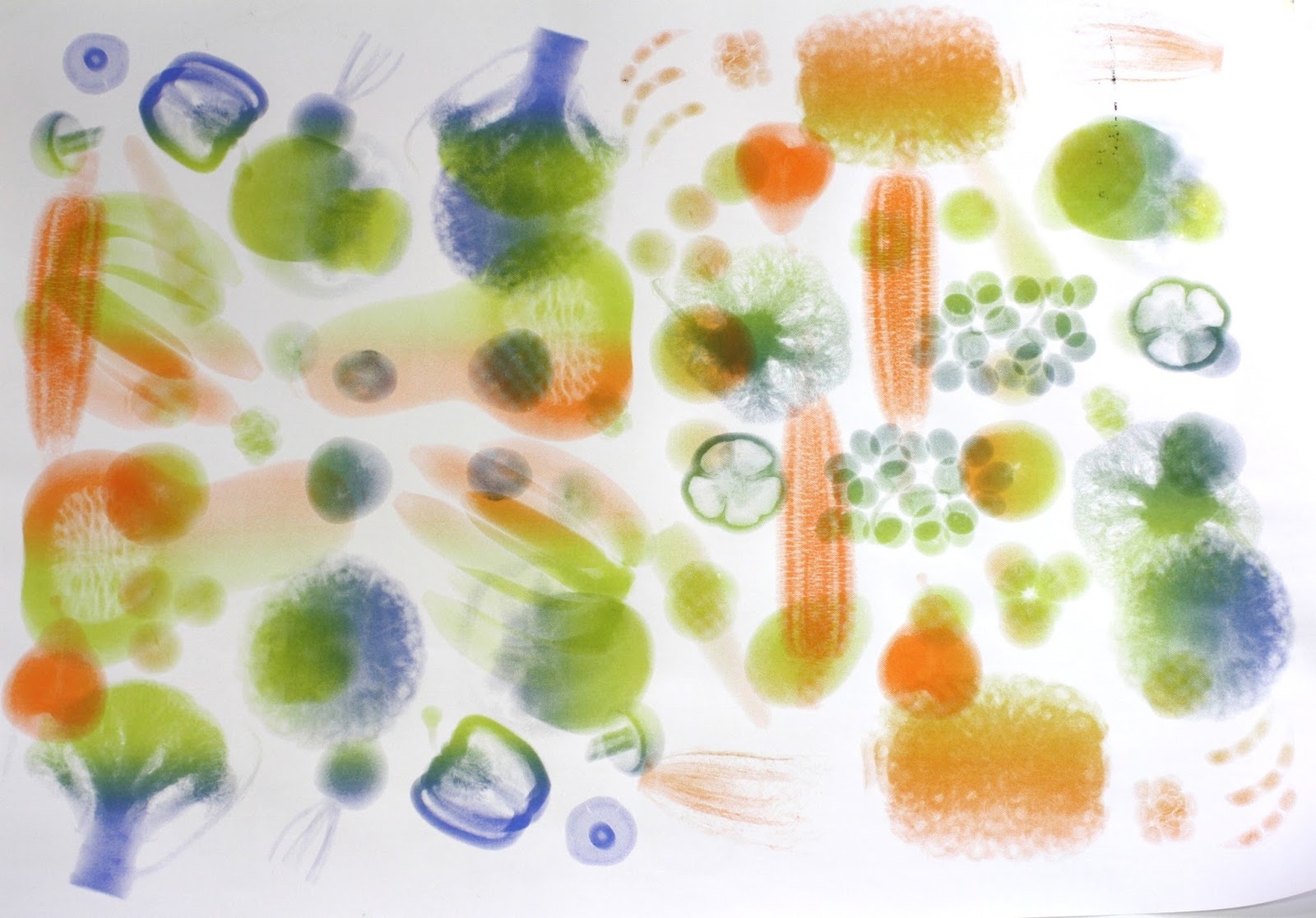
Anyway, I took his advice on board, using the conventional colours from the airport scan (orange, green and blue) and mixing them on the same screen.
First to create a pattern:

And then beginning to layer them:


Layering ver the original orange prints:


And then layering multi-colour over multi-colour:

At one stage when I had some ink leftover that I didn't want to waste, I "Sarah-Hall-ed" a test with some finger painted squiggles...

Also some tests with the white-on-black:

The first layering print was not successful, as I tried to shift and rotate the images by 180 degrees. There were too many overlaps. (The solution was to use diagonal rotation - you can see the result in the final print I chose to display.)
